Overview: Today’s class on accessibility was helpful and interesting to me, as I frequently deal with accessibility issues. As a person with dyslexia, I use many tools, such as text-to-speech, Grammarly, and screen readers. When someone has put the time and thought into making material accessible for me, I really appreciate it. Learning different ways to help others I may not have thought about excites me.
Why Aren’t Accessibility Practices Used More? I think many digital accessibility practices aren’t more well-known or commonly used because people who don’t need these tools tend to forget about those who do. When one isn’t affected by text size, color, hearing, etc., they can honestly forget that some require different standards.
Practices Often Missed: I often see links in text added inaccessibly as I use screen readers. When a link doesn’t say what it’s linking to, it’s nearly impossible to scan for links efficiently. I have also noticed text and background colour issues on many websites or products. As my mom pointed out today, she has an extremely hard time reading white writing on a blue background. She showed me one website she was on which contained this, and with her eye deficiency, she couldn’t read what the website was trying to tell her. This was a big issue for her and the company as she couldn’t understand what the company was trying to accomplish, and the company lost a customer. Making simple changes to a website could benefit both sides.
Practices I Miss: One accessibility practice I hadn’t thought of is adding alt-text to my photos to make them accessible for people who are visually impaired. This added description is necessary for the image not to get lost when people use screen readers and listen to the text rather than viewing it. Now that I have this knowledge, I can simply add alt-text below my images.
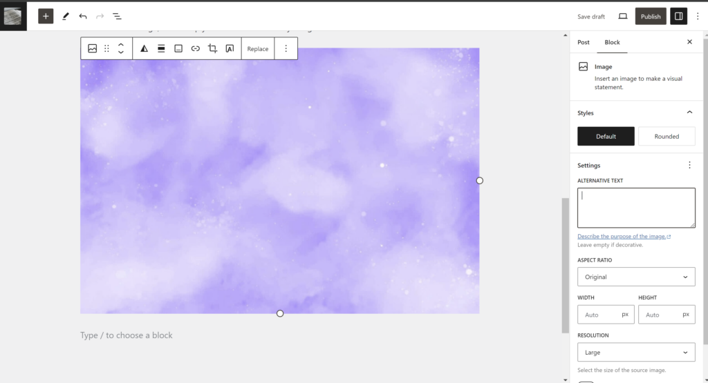
My Accessible Image: This image shows WordPress’s appearance when adding an image. On the right side of the screen, there is a box that says “Alternative Text.” This is where you can add in your description.

Screenshot By Mady Chase
My Accessible Video: This video shows how to make a video more accessible.
Hi Mady, I really enjoyed reading over your reflection this week. I think it was neat that you incorporated your own experiences and struggles with accessibility practices being used within technology. You also made a good point when recognizing that people who don’t need these tools often forget to include them. I wonder if you could have provided a link somewhere in your reflection. This could have maybe been an example on the white text on a blue background so that someone reading this could have a visual of what you were expressing. Overall great work!